A Mood in Colours: How Visual Design Sets the Tone for Your Session
You can usually get a feel for a slot before the reels have even moved.
A fiery red background brings energy straight away. Deep blues and violets can make a game feel calmer or more mysterious. Gold suggests treasure, jackpots and a bit of classic casino drama. Even the colour around the spin button helps set the scene.
Visual design starts shaping a session within seconds, and colour does a lot of the heavy lifting. Across ABXplay’s portfolio, the mood can shift from bright and playful to dark, glossy or deliberately over-the-top long before a bonus feature appears.
The First Impression Happens Fast
Players rarely open a slot and inspect every part of the screen separately. Background, symbols, lighting, animation and interface all arrive together.
Bright fruit graphics tend to feel light and easy-going. Dark fantasy artwork gives a game more weight. Neon brings arcade energy, while softer or more muted shades suit a classic look.
Even familiar reel layouts can feel completely different depending on what surrounds them. Glowing pinks and electric blues create one kind of session; stone textures, fire and bronze create another. The atmosphere is already there before the first decent win lands.
Colour Can Change the Pace
Two games can spin at exactly the same speed and still feel very different to play.
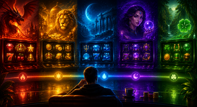
Reds, oranges and bright yellows bring a lot of visual energy, which makes them a natural fit for fire, festivals and treasure themes. Blues, greens and purples often feel cooler and less intense, especially in fantasy, night-time or mystical settings.
That difference becomes more noticeable the longer you play. One screen can stay bright and busy for the whole session, while another feels more relaxed even when plenty is happening on the reels.
Sometimes you want the slot equivalent of a flashing arcade cabinet. Sometimes that much visual noise gets old after ten minutes.
The Best Palettes Belong to the World of the Game
A theme feels more convincing when the colours actually belong there.
Egyptian settings have plenty of room for gold, sand, turquoise and dark stone shades. Jungle games naturally lean towards greens and earthy tones. Space themes can go much further into black, purple, electric blue and neon.
ABXplay moves between those moods pretty freely. Titles such as Lutino Eggs, Power of Zeus and Loving Wheel sit in completely different thematic worlds, from birds and Ancient Greece to a Valentine setting. Each one gives colour a different job, whether that means bringing a setting to life, drawing attention to key details or simply giving the game a recognisable character.
The strongest palettes also make everything sit together naturally. Symbols suit the background, the buttons feel like part of the same screen, and small touches such as glowing borders or win animations keep the mood going.
The best-looking games usually know when to stop as well. The colours should suit the theme and give the game its own character without turning every spin into a light show.
Contrast Tells Your Eyes Where to Go
Colour also helps with something much more practical: knowing where to look.
A Wild should catch the eye quickly. Bonus symbols need enough visual weight to stand out from the regular set. When something important lands, players should understand where the action is without scanning the whole screen.
Contrast does a lot of that work.
A bright symbol against a darker reel background immediately pulls focus. A gold glow can make a feature symbol feel important before you have even checked the paytable. Sometimes the effect is smaller: a border lights up, part of the screen dims or one symbol suddenly becomes much brighter than everything around it.
Your eyes usually get the message before your brain starts doing the paperwork.
A Bonus Can Change the Whole Mood
A feature feels more special when the screen reacts to it.
The background may darken, the lighting can shift, or certain symbols become brighter once Free Spins begin. Even a fairly small change gives the feature a sense of arrival.
Some games keep it subtle. Others go full theatre and transform almost the entire screen. What matters is that the change feels natural within the theme and gives the bonus its own identity.
Returning to the base game can then feel different too. The regular screen seems quieter for a while, which makes the next feature stand out again when it comes.
Too Much Colour Gets Tiring
There is a point where visual excitement starts cancelling itself out.
If every symbol flashes, every win explodes and half the screen is glowing at once, the important moments become harder to spot. Constant intensity eventually turns into background noise.
This is especially obvious during longer sessions. A slot can look brilliant in a screenshot and still become exhausting after twenty minutes if everything stays at full brightness from the loading screen onwards.
Quieter areas give the eye somewhere to rest. They also make the bigger effects work harder when they appear. A sudden burst of light has far more impact after a calmer stretch than it does in a game that has looked like a nightclub since spin one.
Your Mood Changes the Game You Want
Visual taste can change from one session to the next.
A loud neon slot might be exactly what you want for a quick, energetic game. Later, a darker fantasy setting or a cleaner classic screen may feel far more inviting. Sometimes that choice happens before you have looked closely at the features, paylines or volatility.
That is part of the appeal of browsing by theme. Picking a game often means picking a mood at the same time.
The reels still need to keep things interesting once the session gets going, but the visual side decides what kind of atmosphere you are spending that time in.
The Screen Sets the Mood First
Colour starts working before the first spin and keeps influencing the session in the background.
It can make a game feel warmer, calmer, faster, darker or more playful. It helps important symbols stand out, gives bonus rounds their own atmosphere and makes one theme feel completely different from the next.
Across ABXplay, that means there is plenty of room to match the game to the mood. Some sessions call for gold, fire and neon. Others are better with cooler shades and a little more breathing space.
Either way, the screen has already said a lot before the reels stop.